Journal · Style

Colorful Decor: Dopamine Decor and Colorful Decorations

Last updated: November 9, 2026 · Reading time: about 6 minutes

Instead of beige, gray, and white: Under the hashtag #DopamineDecor, many people on social media are sharing photos of rooms with bold colors designed to lift your spirits. The name is a trendy term, not a technical one—it simply means: decorating with vibrant colors. We’ll explain how colors work well together and how to start incorporating color without immediately painting the walls.

First off: caussa is not a fashion label, and none of our products are designed to follow trends. Our designers create contemporary pieces—many of them in bold colors. Here, we show how they can be combined in a colorful interior.
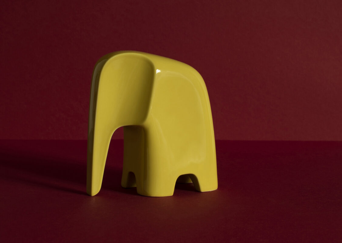
Sun yellow porcelain Olifant against a dark red wall

Pictured: Olifant in Sun Yellow
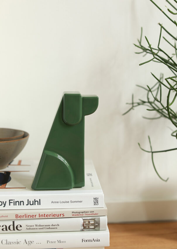
Dog porcelain figure in forest green next to a plant and a book on Finn Juhl

Pictured: Dog in Forest Green

What is Dopamine Decor?

Dopamine Decor describes an interior design style featuring bold, cheerful colors and personal favorite pieces. The focus is on what brings joy to the residents—not on what is currently considered “correct.” A related style is maximalism, which allows for more patterns, colors, and objects.

How do I combine bold colors?

A common rule of thumb is 60-30-10: about 60 percent base color, 30 percent secondary color, and 10 percent accent color. Colors that are adjacent on the color wheel create a calm effect; complementary colors, such as orange and blue, create a dynamic effect. A color that is repeated several times in a room ties everything together.

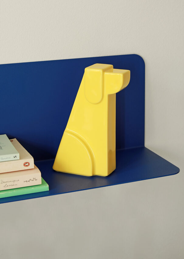
Dog porcelain figure in front of a blue wall with books

Pictured: ” Dog in Sun Yellow” on a “Skwad Shelf” in ultramarine

Dusty rose porcelain Olifant against a pink wall, tone on tone

Pictured: Olifant in Dusty Rose

What is color drenching?

In color drenching, a room is designed using a tone-on-tone scheme: walls, ceiling, doors, and trim are all painted the same color or in shades of that color. This creates a cohesive and calm look, even though the color is bold. Objects in a contrasting color really stand out against this backdrop.

How do I start incorporating color without painting?

Paint doesn’t have to go on the wall. Smaller items are an easy way to get started and can be swapped out quickly: vases, pillows, bowls, figurines. The Wave bowl by Geckeler Michels, for example, is available in natural ash, Green, and Lilac —the grain remains visible through the paint.

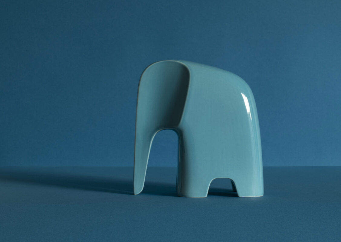
Light blue porcelain Olifant against a petrol wall

Pictured: Olifant in Light Blue

Color Meets Contemporary Design: Here’s How to Combine Them

The following pieces were not designed to follow a trend. However, they come in bold colors—and they show how contemporary design can complement a colorful interior.

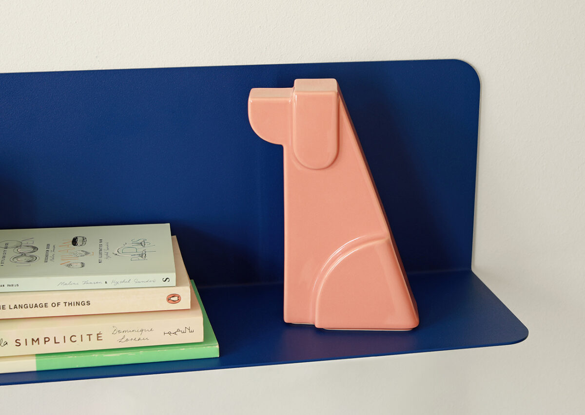
Dusty rose Dog porcelain figure against a blue wall

Pictured: Dog in Dusty Rose

Cat and Dog in Many Colors

The Cat & Dog porcelain figurines by Andreas Kowalewski are available in many vibrant colors—including Flash Orange, Sun Yellow, Curcuma Orange, Forest Green, Night Blue, and Dusty Rose. They can be purchased individually as a pop of color or as a pair in contrasting colors, such as orange and blue.

View Cat & Dog

An Elephant as a Pop of Color

Andreas Kowalewski’s Olifant is also available in porcelain—in colors such as Flash Orange, Curcuma Orange, Forest Green, or Light Blue.

View Olifant
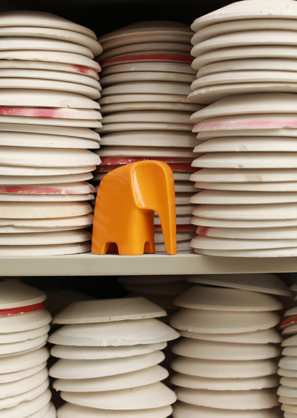
Curcuma orange porcelain Olifant among stacks of plates

Pictured: Olifant in Curcuma Orange

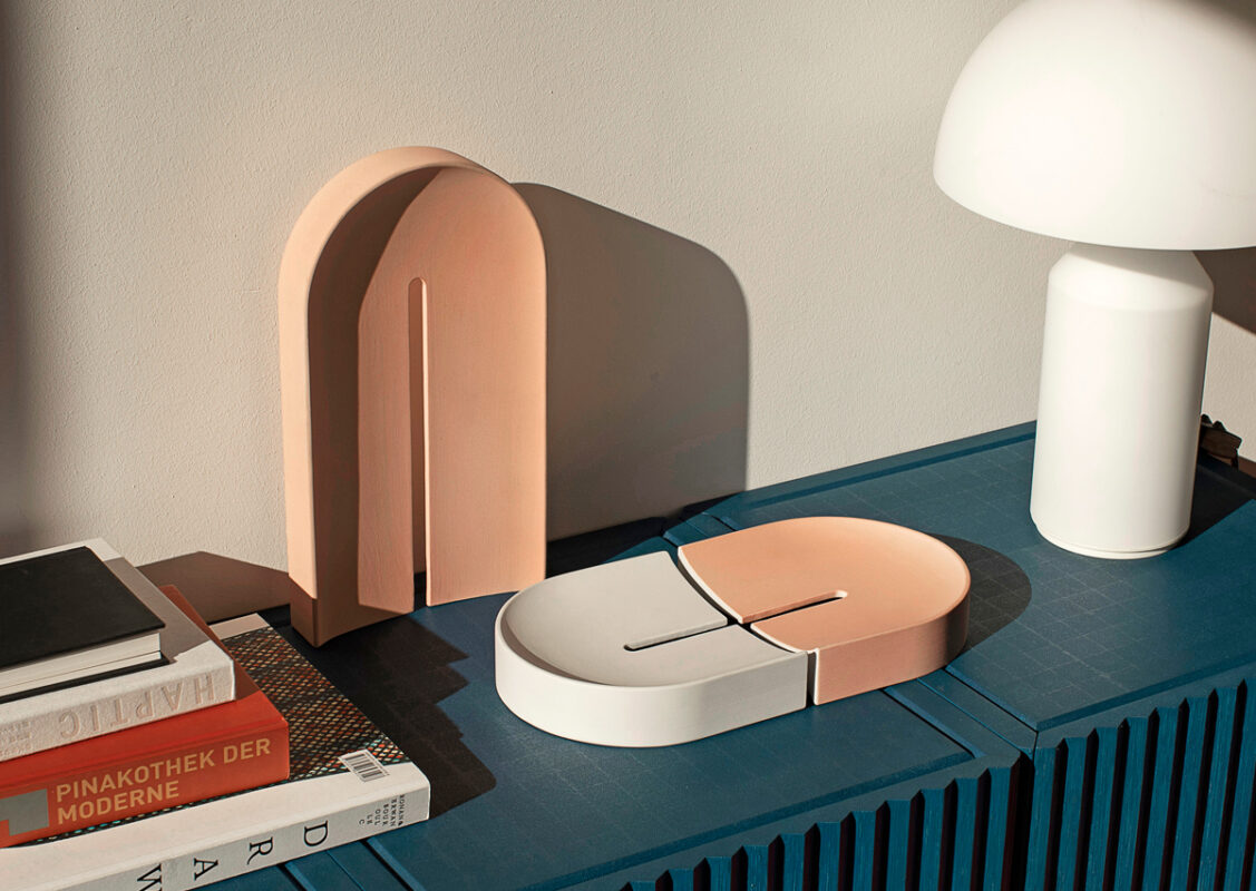
Arc Tray in rose and white on a blue sideboard

Pictured: Arc Tray in white and rosé

A Tray in Rosé

The Arc Tray by De Intuitiefabriek is a porcelain tray with gentle curves. In pink and white, it adds a splash of color to your sideboard, dining table, or hallway shelf—while also keeping small items organized.

View Arc Tray

A Shelf in Ultramarine

“Skwad” by Andreas Kowalewski in ultramarine: a wall shelf that becomes a pop of color in its own right—and against which colorful figurines really stand out.

View Skwad
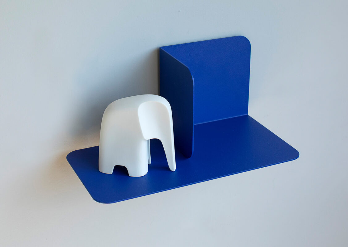
Ultramarine Skwad wall shelf with a white Olifant

Pictured: Skwad Shelf in Ultramarine with Olifant in White

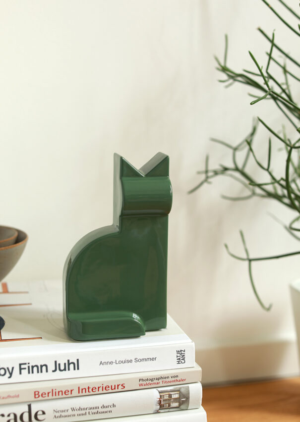
Forest green Cat porcelain figure next to a plant

Pictured: Cat in Forest Green

How can you use a lot of color without making the design look cluttered?

These rules can help:

  • A limited palette: two to three main colors.
  • Calm surfaces to give the eye a break.
  • Repetition: the same color in several places throughout the room.
  • Strategic use: color where you want the eye to land.

Shop the look

Frequently Asked Questions

A trendy term for a colorful interior design featuring bold colors and personal favorite pieces meant to bring joy.
For example, using the 60-30-10 rule and a color that is repeated throughout the room.
Designing a room in a tone-on-tone scheme—walls, ceiling, doors, and trim all in one color.
With colorful objects such as figurines, bowls, trays, vases, or textiles.

Other Interior Design Styles: Mid-Century · Bauhaus Style · An Overview of Interior Design Styles

JOIN OUR WORLD OF DESIGN

10% OFF

Receive design news, early access, and your welcome gift

This field is required.

Privacy guaranteed. Read our privacy policy